Cumulative Flow Diagram: The 4 Shapes That Signal Trouble
A cumulative flow diagram is a stacked area chart that shows bottlenecks, stalls, and batching weeks before a burndown or velocity number would.
Ask most teams what their cumulative flow diagram is telling them and they'll describe the board instead of the chart. That's backwards, and it's also the reason the CFD is the most skipped-over chart in flow-based delivery: it looks dense, so people glance at it once and go back to counting cards.
The direct answer: a cumulative flow diagram is a stacked area chart with one band per workflow stage, plotting the cumulative number of items in each stage against time. Read the vertical gap between two bands at any date and you get the work in progress at that stage right then. Read the horizontal gap between the same two bands and you get roughly how long an item spends there. One shape matters more than the rest: a widening band means work is arriving at a stage faster than it's leaving, and it shows up on the chart weeks before it shows up in a status report. Kanban University's 2022 State of Kanban survey found "improved visibility of flow" was the top reason teams gave for adopting the method in the first place; a CFD is where that visibility actually lives.
In short. A cumulative flow diagram stacks one band per workflow stage and plots cumulative item counts over time. The vertical distance between two bands is work in progress at that stage; the horizontal distance is roughly how long an item spends there. Four band shapes account for nearly every problem the chart reveals: a widening band (a bottleneck), a flat top (throughput has stalled), parallel drift (two stages stuck in lockstep), and a staircase (work arriving in batches, not a steady stream). Read the widening band first, because it's the one shape that gets worse the longer it's ignored.
What Each Band in a Cumulative Flow Diagram Represents
A CFD needs the same three inputs every day: a fixed set of workflow stages, a timestamp, and a count of items currently in each stage. Stack those counts bottom to top in the same order items move through the board, Backlog at the top, Done at the bottom, and each day's stack becomes one vertical slice of the chart. Do that daily for a few weeks and the slices join into bands.
The bottom band (Done) only ever grows; once an item finishes, it stays counted as done. Every band above it can grow or shrink, because items move into and out of that stage as work progresses. The distance between any two band boundaries at a single point in time is the count of items sitting in that stage right now, which is why a Kanban board with visible columns but no daily history behind it can't produce this chart. The board shows the current state; the CFD needs the state on every day that came before it too.
Reading Work in Progress and Cycle Time Off the Chart
The chart below plots a simplified three-stage flow (Backlog, In Progress, Done) over nine weeks, with the middle band starting to widen around week 5.
Through week 4, the blue In Progress band holds a roughly constant width, meaning work in progress at that stage is stable. From week 5 on, the band widens steadily: items are entering In Progress faster than they're leaving it. That's a bottleneck, and the chart shows it four weeks before the Done band's growth rate would flatten enough for anyone to notice from throughput numbers alone. The Backlog band staying roughly constant width the whole time confirms the problem is downstream capacity, not a shortage of demand.
The Four Shapes That Signal Trouble
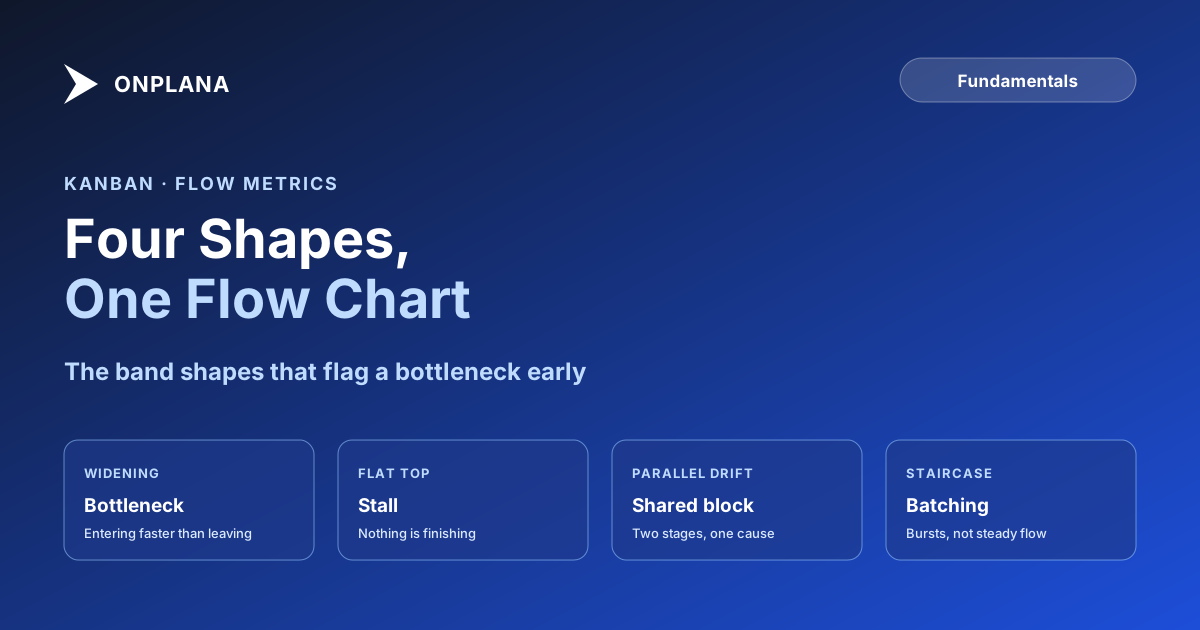
Almost every problem a CFD reveals reduces to one of four band shapes.
| Shape | What it means | What to do |
|---|---|---|
| Widening band | Items enter the stage faster than they leave it | Limit WIP at the stage feeding it, or add capacity to the stage itself |
| Flat top (band stops growing) | Nothing is finishing; total completed work has stalled | Look for a blocked item at the front of the pipeline or a WIP limit that's effectively zero |
| Parallel drift | Two adjacent bands move together instead of independently | They share a bottleneck; the downstream stage isn't free to move faster than the upstream one feeds it |
| Staircase pattern | Bands grow in bursts, then flatten, then burst again | Batching: work is released in chunks, a sprint boundary or a weekly triage, instead of continuously |
Why the Widening Band Is the One to Fix First
The other three shapes describe a workflow that's slow, uneven, or batched. A widening band describes a workflow that's actively getting worse, because the gap it measures, items waiting in that stage, keeps growing every day the underlying cause goes unaddressed. A flat top or a staircase is a problem to schedule time for. A widening band is a problem that compounds while it waits, since every new item arriving at that stage joins a queue that's already longer than the one before it.
That's also why a CFD catches this earlier than a velocity or throughput number would. Both of those are calculated from completed work, so they only move once something finishes. The widening band moves the moment an item starts waiting, which is the whole point of watching work in progress directly instead of only counting what's done.
Building One From a Board You Already Run
- Pick a snapshot time and hold it fixed. Once a day, same time, count how many items sit in each column.
- Freeze the column definitions before you start. Adding or renaming a column mid-history breaks the comparison between last month's chart and this month's.
- Stack the counts in board order, bottom to top, earliest stage on top. The stacking order should match the order items actually move through, not an arbitrary sort.
- Give it two to three weeks before reading shape into it. A single day's dip is noise; a shape that holds for two weeks is a pattern worth acting on.
A cumulative flow diagram doesn't replace a stand-up or a retro. It replaces the guesswork about which stage is actually the problem, because the answer is the band that's widening, not the one everyone happens to be talking about that day.
This sits alongside the rest of the flow metrics and estimation posts on the blog: reference material for the diagnostic questions a board alone can't answer.
Frequently asked questions
What is a cumulative flow diagram?
A cumulative flow diagram (CFD) is a stacked area chart with one band per workflow stage, plotting the cumulative count of items in each stage against time. It shows work in progress, roughly how long items sit in a stage, and whether a stage is falling behind, all in one chart.
What does a widening band mean in a cumulative flow diagram?
A widening band means items are entering that stage faster than they're leaving it, which is the definition of a bottleneck. It's the single most useful shape in a CFD because it shows up weeks before the delay is visible in a status report.
How do you read work in progress from a CFD?
Draw a vertical line at any date. The vertical distance between two adjacent bands at that line is the work in progress at the stage between them, at that moment.
How do you read cycle time from a CFD?
Draw a horizontal line at a given cumulative count and measure the horizontal distance between two bands. That distance is roughly the average time an item spent in the stage between them, though it's an approximation, not an exact per-item measurement.
Is a cumulative flow diagram the same as a burndown chart?
No. A burndown chart tracks one number, remaining work, against a sprint timeline. A CFD tracks every workflow stage at once and has no sprint boundary, which is why continuous-flow teams use it and sprint-based teams tend to use burndown instead.
What data do you need to build a cumulative flow diagram?
One snapshot per day of how many items sit in each column of your board, taken at the same time each day. Most Kanban tools compute this automatically from status-change history; without one, a daily manual count works, it's just easier to let a drift creep in.
Ready to make the switch?
Start your free Onplana account and import your existing projects in minutes.